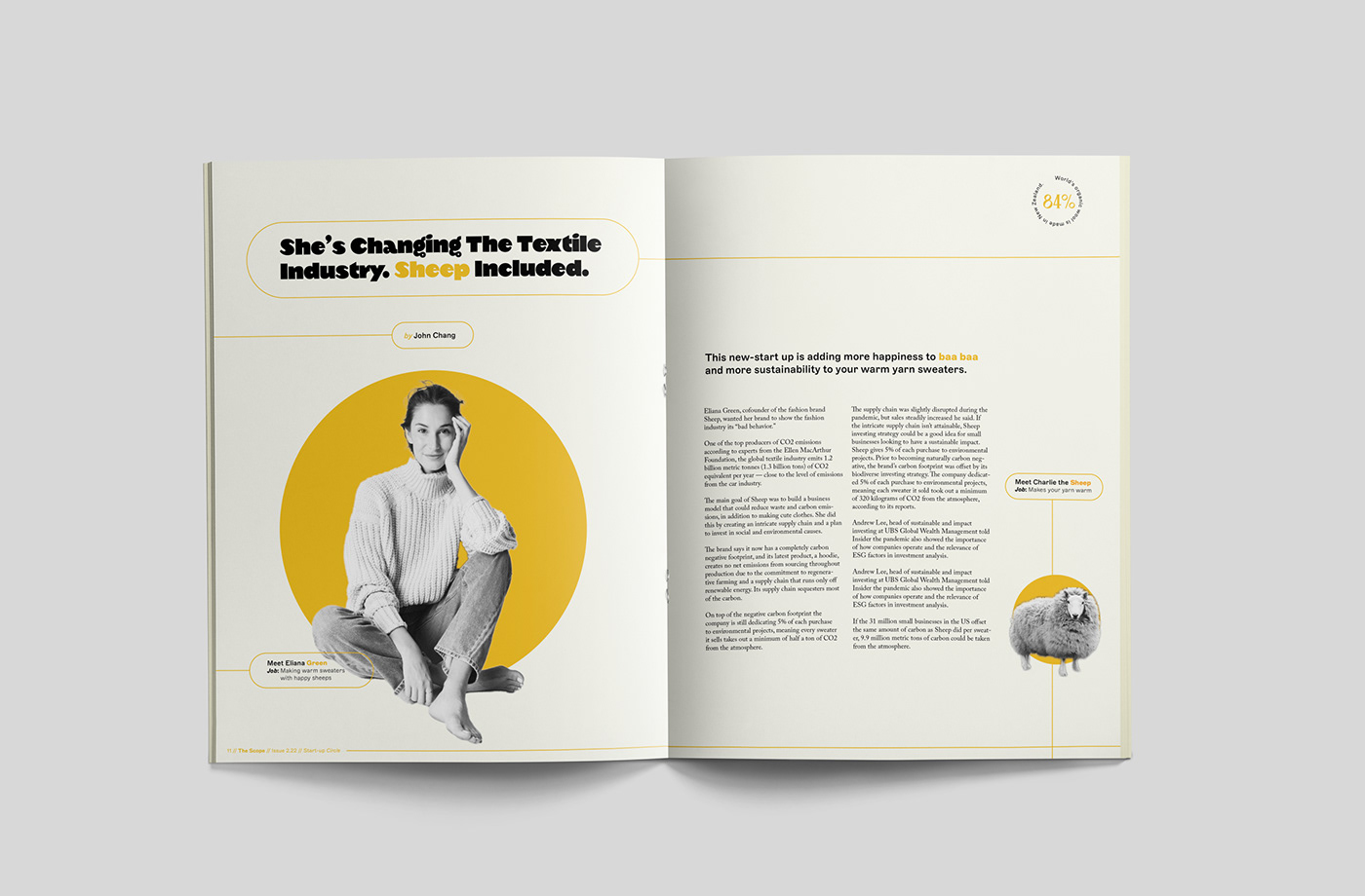
Design with an impact for the Kinder Business Dispatch.
The Scope is a business magazine focused on community, sustainability, and business social responsibility. The proposed magazine’s design system is a play on the graphic language of corporate presentations and reports mixed with a delicate color palette that underscores the focus on social and environmental issues. Bold typography, lines, and the oval motif are used in an editorial system to emphasize copywriting and create layouts with a real impact.
The new nameplate is a simple wordmark that reads contemporary with a sensibility for the tradition of sophisticated editorial design. The combination of condensed uppercase letters with large-rounded O & C gives the wordmark a strong rhythm and a classy feel of elegant vintage signs. Le Monde Livre and Magiel feature as the headline typeface with Adobe Caslon Pro used for body copy. The sans-serif Marfa is used as a complementary typeface, mainly for captions and infographics. Different color backgrounds are used to signpost each issue of the magazine, and the masthead color on the cover changes according to the topic.
Project recognition: World Brand Design Society Creative Design Award 2023; One Club Bronze Award 2022 (SD Chapter)